Personal Projects : Urban Environment
|
Urban areas are very developed, meaning there is a density of human structures such as houses, commercial buildings, roads, bridges, and railways. "Urban area" can refer to towns, cities, and suburbs. An urban area includes the city itself, as well as the surrounding areas.
|
"Will urban sprawl spread so far that most people lose all touch with nature? Will the day come when the only bird a typical American child ever sees is a canary in a pet shop window? When the only wild animal he knows is a rat-glimpsed on a night drive through some city slum? When the only tree he touches is the cleverly fabricated plastic evergreen that shades his gifts on Christmas morning?" ~ Frank N. Ikard "The city is not a concrete jungle, it is a human zoo." ~ Desmond Morris |
Initial Research:


My initial investigation: Preston Docks
Shoot plan: To start off my investigation in researching Urban Environments, I will be going round a heavily Urban area: Preston Docks. Here I will explore different building types and different angles I can take images from. I will do this whole shoot in black and white on my bridge camera in natural daylight. I will adjust the white balance on my camera to cloudy. When considering exposure, I intend to shoot with a fast shutter speed of 1/500 to create a clear image. Following the shoot, I plan to digitally edit my images using PIXLR. This is to adjust things like contrast and exposure.
Contact sheet:

Edited images:
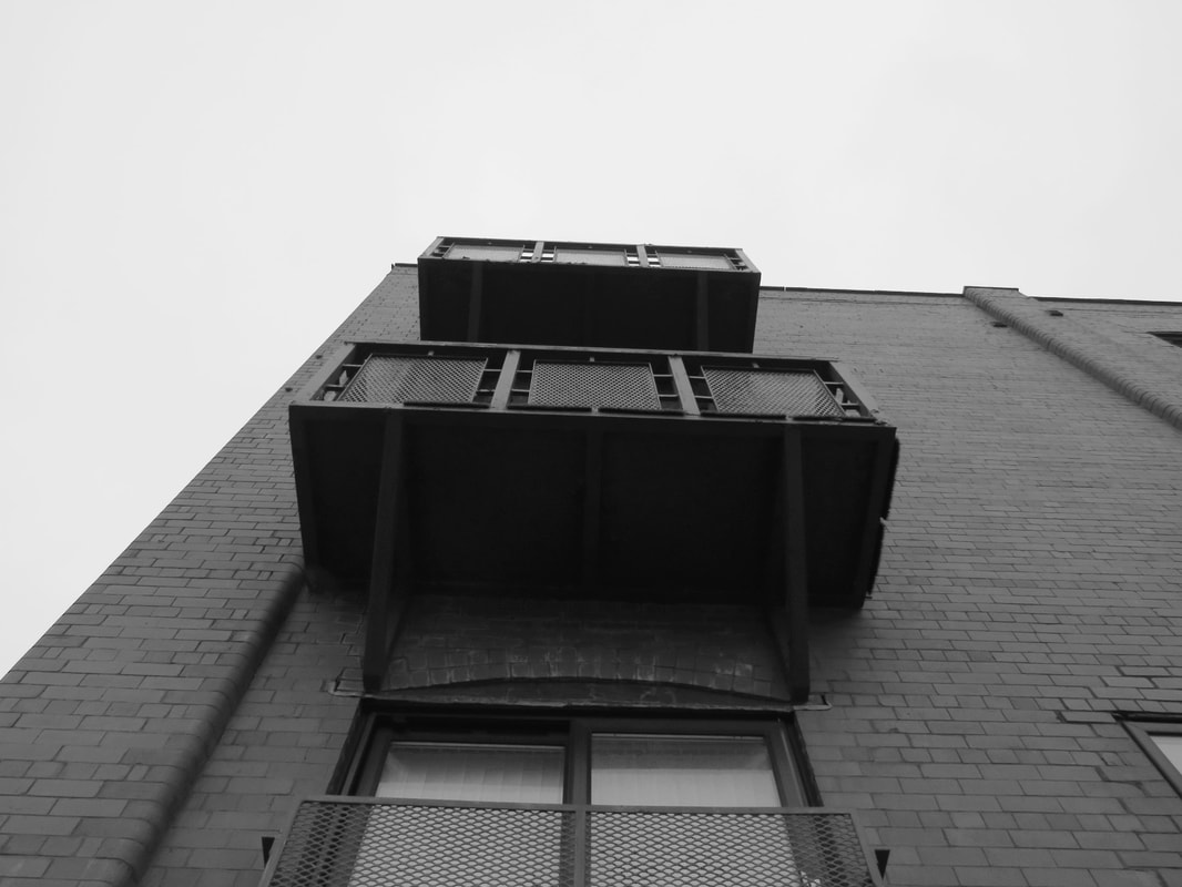
To edit this image I increased contrast and decreased brightness. The strengths of this image is the element of shape and lines. However the disadvantages is the lack of saturation, as this particular image would have been stronger in colour.
|
to edit this image, I experimented with the levels and decreased the exposure. I particularly love the eery effect this image has and I like the lack of saturation. However, This image is very dark and the contrast is possibly a bit too high.
|
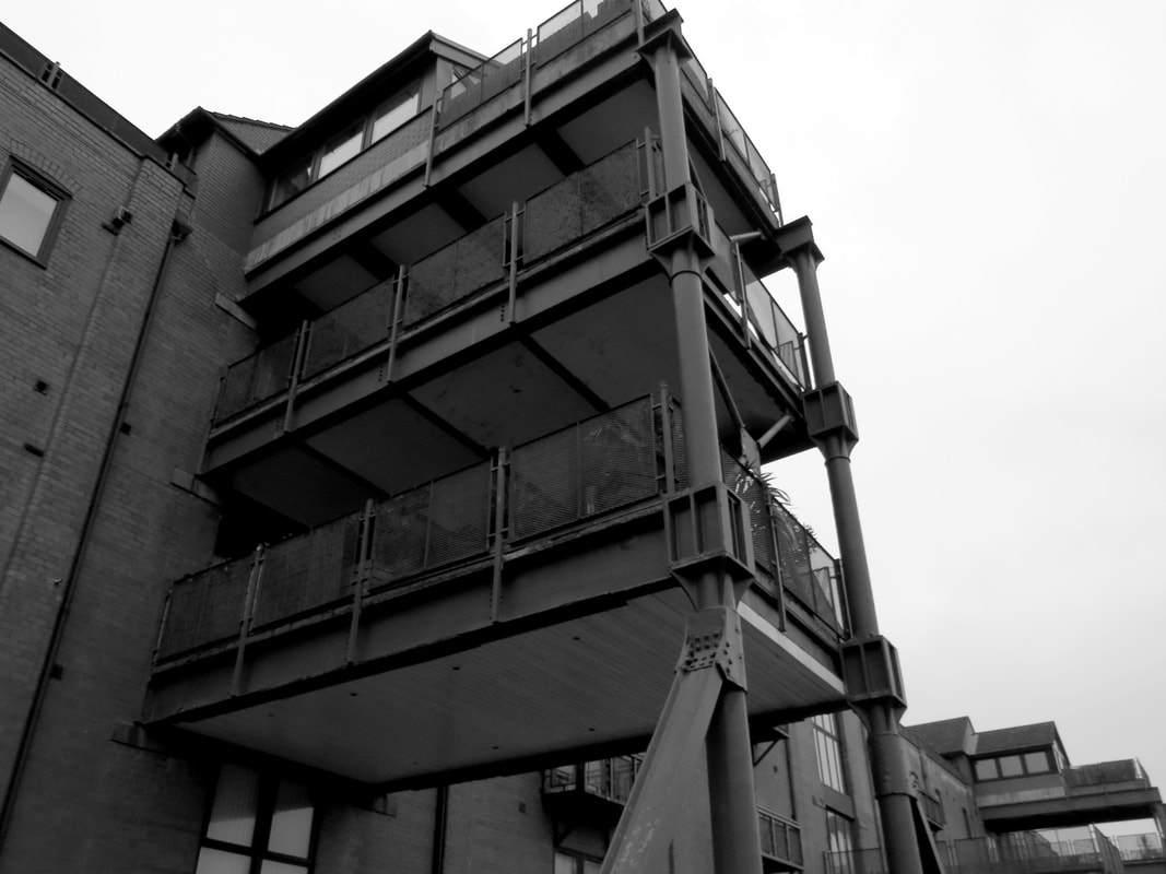
To edit this image I decreased contrast to increase the detail and I increased exposure. The strengths of this image is the amount of detail. Although I don't like the angle is was taken at as I feel it doesn't show all the image.
|
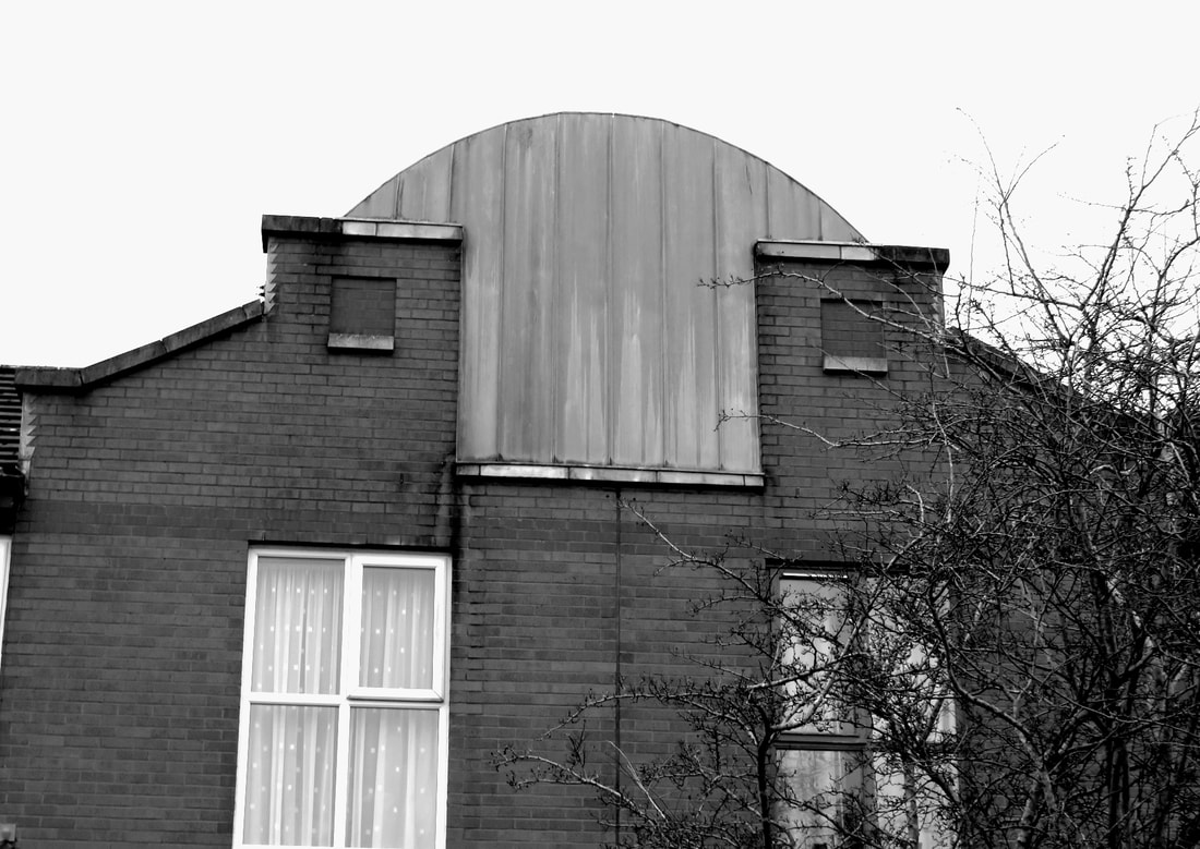
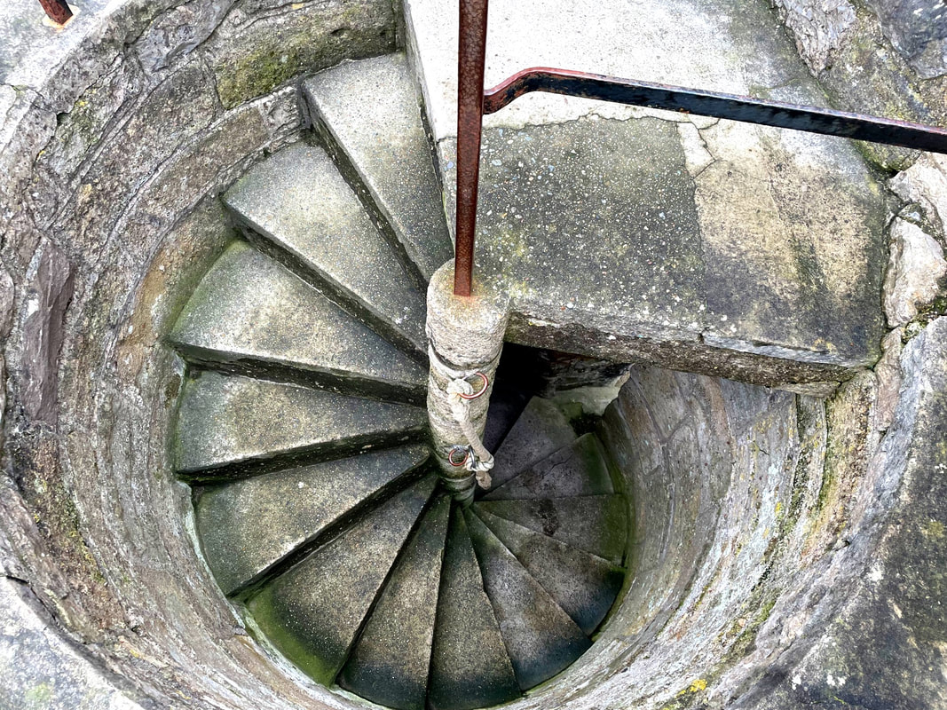
To edit this image I rotated it, cropped it and adjusted the contrast, exposure and levels. I personally love the angle this was taken at as i think the works eye view is very effective. I do not like the lack of detail in the sky surrounding it.
|
BEST IMAGE:
Evaluation:
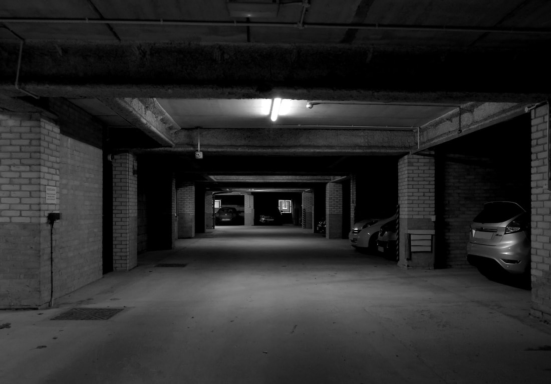
I would say that this is my best image because of the dark, eerie atmosphere it has and the emptiness contrasting with the cramped feeling this image portrays. To edit this image I adjusted the levels, exposure, contrast and I also coloured in the car plates.
I would say that this is my best image because of the dark, eerie atmosphere it has and the emptiness contrasting with the cramped feeling this image portrays. To edit this image I adjusted the levels, exposure, contrast and I also coloured in the car plates.
Artist Investigation / Pedro Correa


|
I chose to investigate the artist Pedro Correa because I love his final outcome which is blurred. I also love his use of colours which he will have learned to successfully incorporate in his work when he studied oil painting and comic art at the Brussel's Royal Academy of Arts. Pedro Correa, when being interviewed, he described his work as Impressionistic, light and Poetic.
I believe studying the work of Correa will really strengthen my photography skills as it will encourage me to look in more detail at layering images together and looking at what would look good combined. "I really love the fact that I have to be 100% alert all the time to what surrounds me, that if I blink I can miss a moment of grace and beauty that was standing just next to me."-Pedro Correa |
|
Pedro Correa says that his style was born by injecting the emotions of impressionism into the "decisive moment" of photography. His techniques if fine art photography; Fine art photography is a style of photography created by an artist. Fine art photos are photographs created purely for their aesthetic and imaginative qualities. Fine art photographers create work that goes beyond merely capturing what is in front of the camera.

"All my pictures are love songs to the city. Not any particular one, but rather the universal idea of a city." - Pedro Correa |
How I would emulate at home:
To emulate Pedro Correas work, I would go to a city centre and use Pedro's technique of fine art which means I will shoot anything that is aesthetic and pleasing to the eyes. He also takes pictures of bright, colourful and interesting things so i will also emulate him by doing that too. The lighting will therefore obviously be natural light from outside and I will take the pictures from different angles and perspectives. 
|
SEMI ANALYSIS : PEDRO CORREA

|
Subject:
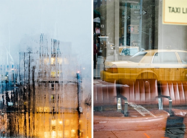
The photographer of this image is Pedro Correa and the title of this Photograph is wooden cab which was created in 2013. The genre of this photograph is architecture and the technique is realism. Element: The composition of the photo shows the reflection of a cab in a window in the foreground and inside is a row of red leather chairs. The viewer’s eye is lead around the photo because of the composition & perspective Pedro Correa has used. The perspective that Pedro Correa has taken the photo from is at eye level view. This perspective is effective because it shows the reflection of the busy city life in the background. The photographer employs a range of visual elements in his work. The most striking elements are pattern, line and colour (which is shown on the left) Media: The photo has been taken from a short distance so the main field of view is of the red leather chairs and the cab and so that any distractions of people in the picture has been cropped out. The photo has been taken outside using natural lighting. The light source is placed on the right which is highlighting parts of the focal point. To emulate this photograph myself, I would use a fast shutter speed to create a crisp image and I would take it in day time to get a well lit environment. Additionally I would also need to research photographing with reflections. Intent: I feel this photo coveys a message of calmness in a busy energetic city which creates a calming mood. It does this by displaying a room with empty seats in, where nothing is happening, in contrast to the reflection outside where there's cars and people. |


|
|

|
Artist Investigation / Tomás Cambas


|
Techniques: Tomas unique artistic language is influenced by Russian Constructivism and the works of Laszlo Moholy Nagy, Alexander Rodtchenko and Bern & Hilla Becher. He also features in an art therapy exhibition. Art therapy is the use of a creative medium for therapeutic effects. It has a wide range of applications, from reducing everyday stress to treating serious mental illness. Art therapy has been found to improve feelings of self-confidence and self-expression, as well as to help people come to terms with physical illnesses.
Why this Artist? I chose to investigate the work of Tomás Cambas because I really like the way he searches to take pictures of things with interesting shapes and bright colours. His work often also shows symmetry in shapes and he takes his images in the day to get good night lighting without lots of shadows. Furthermore, he uses the rule of thirds. |

|

"Shrubbery"
|
"Tomás is one of the most talented and meticulous photographers I have come across lately. Not only does his subject matter and media make him unique, but the beauty and mystery that arises from his cityscapes too. At such a young age, Tomás has already been selected by strict juries for several prizes; I anticipate a promising future for him in the art world." How I would emulate:
To emulate Tomás Cambas' work, I would take pictures of buildings outside at daytime to get a bright natural light over the subject. I would also use a 3x3 grid so I could use the rule of thirds and I would use a tripod to get a steady picture. To digitally edit after, I would slightly increase saturation to make the colours captured pop. I would also search for bright colours and interesting shapes. |
SEMI ANALYSIS : TOMAS CAMBAS

|
Subject:
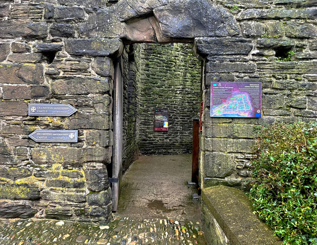
The photographer of this image is called Tomás Cambas. The title of this Photograph is "H" and it was taken in 2016. The genre of this photograph is landscape and architecture. The props I can see in this picture are a smashed up wall and trees and plants being framed through this gap in the wall. Element: The layout and composition of the photo shows the leaves and plants being framed by the square hole in the smashed wall. The rule of thirds has been used here. This is also similar to the work of Pedro Correa as his work involves framing and the use of shapes, such as rectangles and vertical lines. The viewer’s eye is lead around the photo because of the composition & perspective Tomás Cambas has used. The perspective that Tomás Cambas has taken the photo from is at eye level. The photographer employs a range of visual elements in his work. The most striking elements are shape, space and line. Media: The photo has been taken from a short distance so the rest of the wall and building has been cropped out of view and only parts of the pink wall are in the main field of view. This is so the window into the jungle area is the main focal point of the image. The photo has been taken outside using natural light. The light source is placed on the left which is highlighting parts of the rock on the bottom right and parts of the leaves. To emulate this photograph myself, I would take the picture in day time using natural light, I would use a tripod to get rid of camera shake and I would use a fast shutter speed. Intent: I feel the photo coveys a message of calmness. It does this by incorporating elements such as line, texture and shape. This is relevant to this project as the broken building is an urban environment, however, the plantain that is included contrasts to this project but shows how they can be involved together. In my opinion, this image is really successful and i love the colours and framing used. |


|
SHOOT PLAN:
I have drawn inspiration from Tomas Cambas because his work often incorporates the style of line and I like how he appreciates the use of coordinating colours. I plan for the shoot to take place in a town centre because there is lots of buildings and life there which provides lots of opportunity to emulate Cambas' work. The equipment I intend to use is just a camera because I will only be photographing things that are not set up and taking candid shots. The lighting conditions I will require is natural day light and my subject will be lit from all directions. I will be using my bridge camera and will be using a fast shutter speed to get a crisp image with no blur. Following the shoot, I plan to digitally edit my images using PIXLR by enhancing colours contrast or adding a vintage effect. I also might add a reflection in.
I have drawn inspiration from Tomas Cambas because his work often incorporates the style of line and I like how he appreciates the use of coordinating colours. I plan for the shoot to take place in a town centre because there is lots of buildings and life there which provides lots of opportunity to emulate Cambas' work. The equipment I intend to use is just a camera because I will only be photographing things that are not set up and taking candid shots. The lighting conditions I will require is natural day light and my subject will be lit from all directions. I will be using my bridge camera and will be using a fast shutter speed to get a crisp image with no blur. Following the shoot, I plan to digitally edit my images using PIXLR by enhancing colours contrast or adding a vintage effect. I also might add a reflection in.
CONTACT SHEET:

EDITING PROCESS - PIXLR:

4 BEST IMAGES:

The strengths of this image is it follows the rule of thirds which is strongly used by Tomas Cambas and it follows he same pattern of different colours. The weaknesses of this image is it has a large depth of field which contrasts to Tomas Camas' short depth of field. However I like my twist on his work as I think it adds more interest to the image.
|
To edit this image, I cropped it and rotated it slightly, then I increased saturation to make the colours pop. Then I increased contrast and brightness. The strengths of this image is that it follows the rule of thirds and strongly incorporates the feature framing. The weaknesses of this image is that the leading lines are slightly wonky as the picture wasn't taken
|
In this image I cropped out any distractions from the surroundings and I adjusted the brightness, contrast, saturation and exposure. The strengths of this image is the use of the technique shape and lines. However the weaknesses for this image is the lack of colours.
|
To edit this photo, I adjusted the saturation, contrast, exposure and brightness. Then I cropped and rotated slightly. The disadvantages of this image is the dull colours, however there is a pop of colour on he poster on the wall. The advantages of the image is the use of framing and parallel lines.
|
Best Image Evaluation:
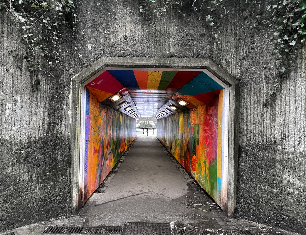
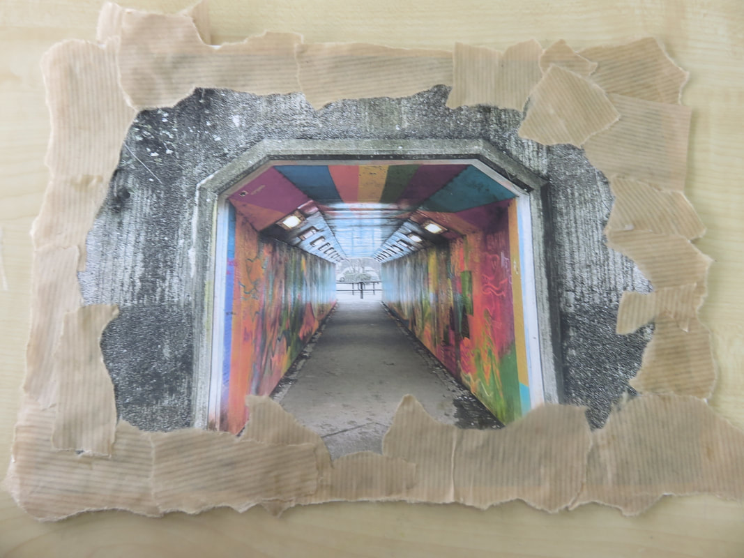
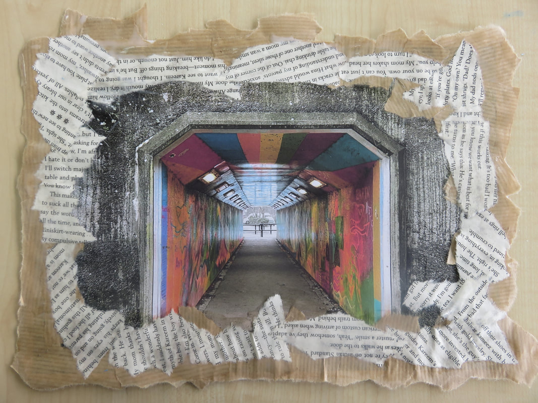
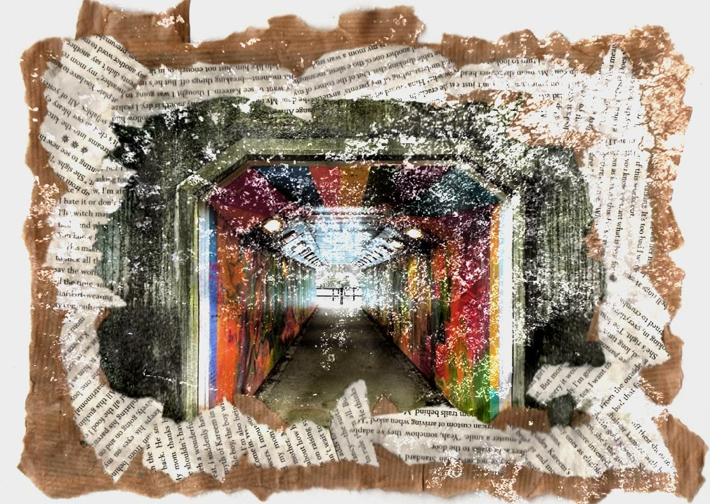
I personally have chosen this image as my best final outcome because I believe it is emulating the style of Tomas Combas most directly, However I have personalised it and added my own take on it. I have emulated his work, because I have used his technique of framing and colour. This has been done as the doorway around the tunnel frames the beautiful graffiti inside. This graffiti is also inspired by Cambas, as it has been photographed by searching for beauty in unlikely places.
However, I have added my own style to this image, because I have selected the outside of the focal point (the tunnel) and desaturated it. This technique of using monochromatic colours is really effective, as it brings contrast and conflict into the picture.
In conclusion, This is my favourite image as it incorporates all the techniques Tomas Cambas uses and it has an emotive feel to it.
Artist Investigation / Mihai Florea


|
Why this artist:
I chose this photographer because I think his work is really inspirational. I love his monotone pieces that are massively using the element pattern and line. He also focuses on composition, balance and lighting, which, in his opinion are the three most important aspects of the architectural photography. I like the contrast used in these images and the simplicity of no distractions in the background. Florea also clearly uses the rule of thirds in his images as he looks at the flow of straight and curved lines. Technique: Mihai Florea likes to use long exposure techniques to allow the flow of nature to be visible in his images and to create a sense of depth, a third dimension in a two dimensional format. To add to this, he also takes all his images in black and white. |
"I consider myself a minimalist architectural and photographer with a desire to create abstract images from the reality surrounding me. I would like to believe that my images are pushing beyond the expected and that they offer a different way of looking at the built environment, especially the contemporary one." - Mihai Florea To emulate Mihai Florea's work, I would go to a city filled with sky scrapers and take pictures in black and white, using a 3x3 grid (to help use the rule of thirds) and I would take the pictures from a below perspective looking up. I would also use a long exposure to emulate his work even more accurately. Finally, when looking at elements to photograph, I would seek out areas with symmetry, lines and curves.
|

|
COMPARATIVE SEMI ANALYSIS : MIHAI FLOREA VS TOMAS CAMBAS

Subject:
The photographer of the first black and white picture is Mihai Florea and the photographer for the last image is Tomas Cambas. The genre of both of these images is urban environment, architecture and landscape. The props in the photograph by Tomas Cambas partly contrast with Mihai Florea as one of them incorporates nature, greenery and leaves into his work and the other focuses only on concrete and buildings. The first image looks like it is taken in an indoor car park and the second looks like it is taken outside of an abandoned building. Element: The composition of these photos show that both photos are taken from eye level. However, Tomas Cambas has his images as a restful composition and the other has a dynamic composition, where the lines carry on further outside of the image. The biggest contrast with the compositions of these images is the element colour. Mihai Florea only uses monotone black and whites in his work, where as Tomas Cambas uses bright, vibrant colours in all his work. In similarity, both of these artists strongly incorporate the elements line, pattern and symmetry in their work. The rule of thirds has been used throughout both of their work. Media: Tomas Cambas has taken his image from a short distance with the window of leaves as his focal point. On the other hand, Mihai Florea has taken his image from a long distance and has no clear focal point. The viewers eyes are led around his image due to the straight and diagonal lines filling the photo. Both of these pictures have been taken using natural light, one direct with no shadows and the other with sunlight shining through gaps in the walls. This creates an atmosphere of darkness and lack of light in the first one and the other one of brightness and therefore joy. intent: I feel these images convey a message of darkness contrasted with brightness, for example sombre vs energetic. It does this by displaying the strict straight lines vs the carefree rough lines and then furthermore by the different colour contrast. |


|
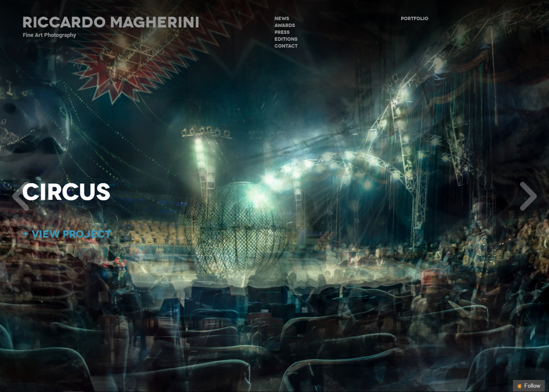
Artist Investigation / Riccardo Magherini


|
Why this artist:
I chose to research the work of Riccardo Magherini because I find his idea of nothing ever standing still inspiring. I strongly feel that all his work is very intriguing due to the busy and crowded atmosphere they give off. I also believe that all of his work show that he is well cultured and diverse. His work further gives a deeper meaning of our quickly moving world and the sense of rush people feel on a day to day bases. Magherini uses the elements colour, space and form successfully. Technique: Riccardo Magherini uses the technique of overlapping multiple images over each other, Riccardo's photographs have a painterly quality, and with the endless illusion of depth, he creates works that resembles abstract paintings. |
"Magherini takes multiple frames of the same location, and layers them to create unique images that distort the subjects within the picture, and create a sense of movement. Much like Hockney and Picasso, the pieces seek to capture the dynamic nature of the world and how it is never static. Even though the image depicts a building made of stone, a frantic energy is ever present."- The photography project. How I could emulate his work:
To emulate Riccardo Magherini's work, I will take multiple shots of cities and over layer them and reduce the transparency so you can see a blurred mix of all images. I will make sure that in my shots there is lots of light coming off my subjects as this is what Riccardo Magherini's work includes. |

|
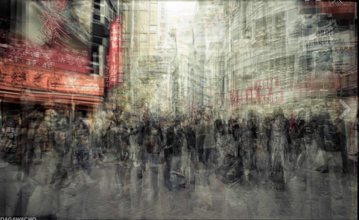
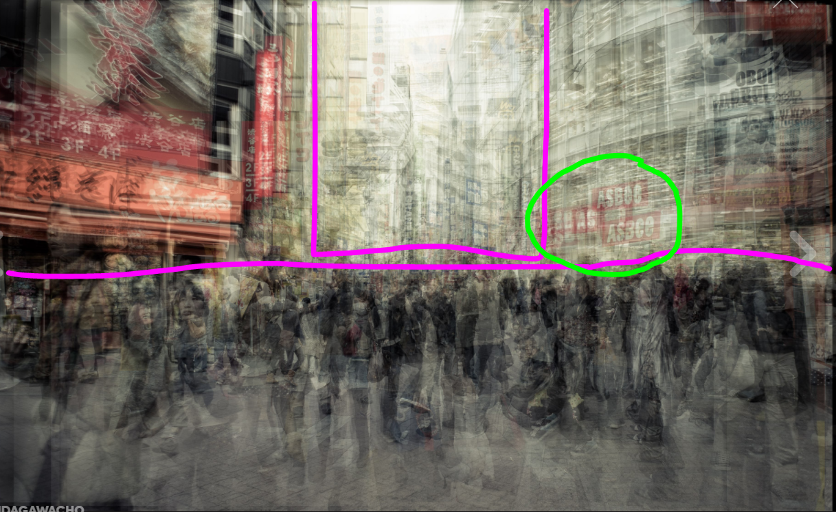
COMPARATIVE SEMI ANALYSIS : RICCARDO MAGHERINI VS PEDRO CORREA

|

Subject:
This image was taken by Riccardo Magherini and the bottom was taken by Pedro Correa. This image is called "Udagawacho" as it was taken in this city, and the second was entitled "Espresso Bar". The genre of these photos is urban environments. The subjects in the first picture is silhouettes of lots of people walking around a city, similar to the silhouettes sat in a café in the second. Element: The composition of the first photo shows a large city centre with lots of skyscrapers and people crowded in the middle of the image. There is a mix of around 3-5 photos overlayered with its transparency reduced and the photo being slightly adjusted each time so it creates a blurred effect. This is different from the second photo as there is only one layer and, although similarly it focuses on urban environment, its main focus is on the inside of a window, so you can only see the indoors rather than outdoor skyscrapers. These artists both highlight the elements: shape, perspective and they both contrast with their ideas using colour. Media: Riccardo Magherini takes his picture from a long distance where as Pedro Correa takes his from a short distance. The main focus o both images is unclear and is mainly just of an urban environment. The first image is taken using natural lighting, however the second is taken using artificial lighting coming out of the café. This creates an atmosphere because of the grey tones and shadows displayed in the first. Intent: The intent behind these images was to show the contrast between the busy city life and how pact and crowded it can be compared to how calming and atmospheric it can be. In my opinion, both these images are very successful. |
|
SHOOT PLAN:
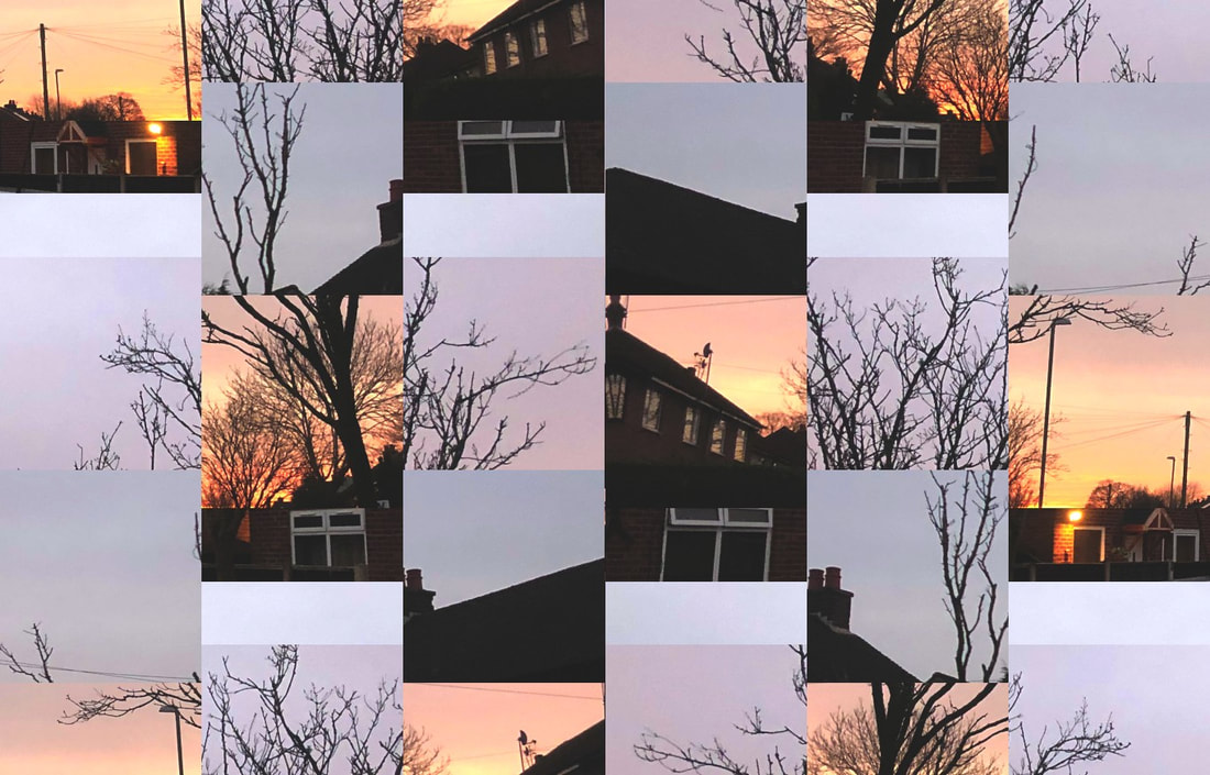
I have decided to emulate the work of Riccardo Magherini I have drawn inspiration from him because his work oh layering the same image multiple times really interests me and I love how busy the end result looks. I plan for the shoot to take place in a city centre because I want to capture a full cramped area. I will use natural light and experiment with high key photography. My subject will be well lit with daylight as it is outside. I intend to use my bridge camera without a tripod as I will be editing the images post shoot to be blurry so camera shake isn't an issue. Following the shoot I will be using PIXLR to create a multi-layered image and do further edits. |

|
CONTACT SHEET:

EDITING PROCESS - PIXLR:

4 BEST IMAGES:
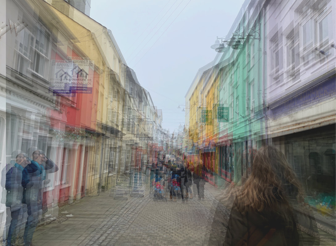
The strengths of this image is the use of pastel colours and the angle it was taken as really helps to highlight the atmosphere in this town centre. The disadvantages are that before duplicating layers and blending them, I should have increased the saturation of the sky to make it more vibrant.
|

I personally believe the strengths of this image is the blurred effect is tasteful and not too much. I also feel that the colours (like in the sky) are really saturated and bright. However, the drawbacks of this image is the buildings are slightly underexposed.
|
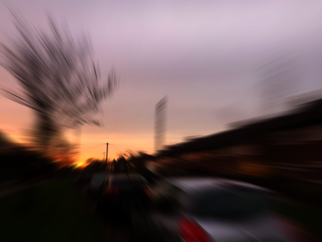
Firstly, I really like the lighting in this image as it was taken at golden hour (sunset), which casts a beautiful orange colour onto the houses being photographed. I think the blurred effect is effective, although there are no people in it which contrasts to Riccardo Magherini's work.
|

This image is effective, due to the movement of cars through the blurred effect ; it creates a sense of anticipation. I also like the incorporation of nature through the greenery. On the other hand, i dislike how exposed the white building is, which i feel makes it loose its detail.
|
Best Image Evaluation:

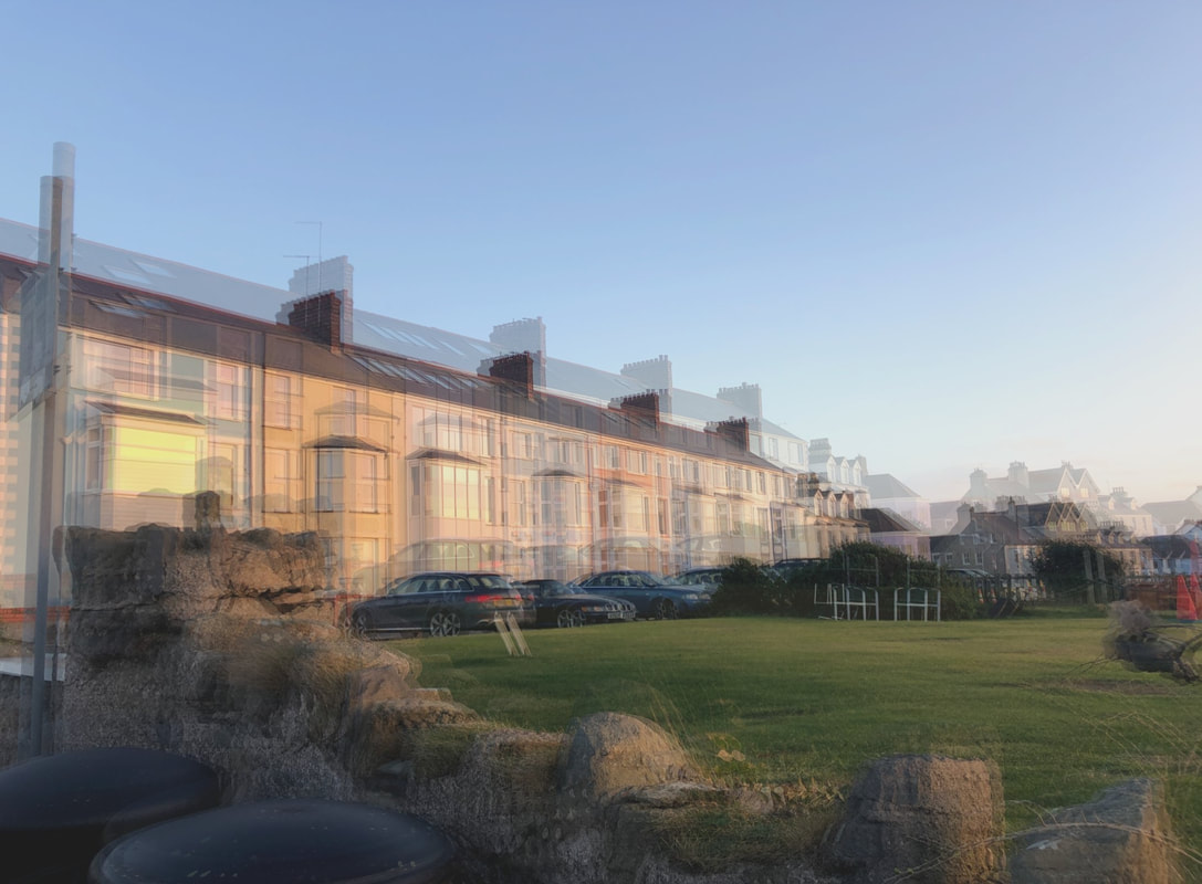
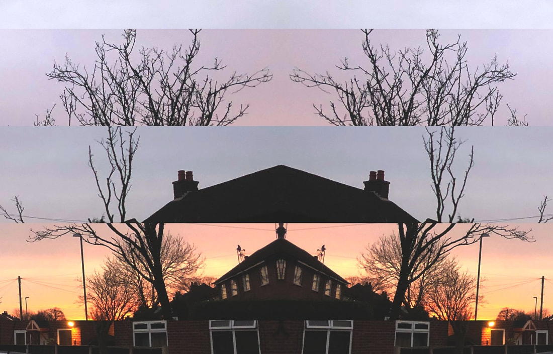
I feel that this image is my most successful, as it follows the techniques that Riccardo Magherini uses. This is creating a sense of time passing using only one image and duplicating it multiple times. This image is more successful than my other images, because it has people in it who are walking in groups, almost along the picture. This image also has a tunnel effect, this means that the leading lines all direct from the edges to the centre of the image. Effectively, this draws spectators in as it has a sense of depth. My favourite element to this image is that the figures in it have a ghostly feel to them which juxtaposes the cheerful childlike atmosphere the buildings give off.
Photo Safari shoots:

PHOTO SAFARI CONTACT SHEETS:


|

|
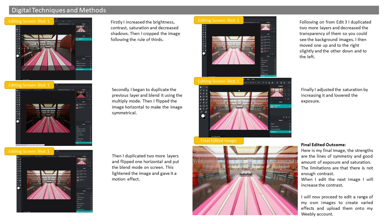
PHOTO SAFARI EDITED IMAGES:

|

|

|

|
|
|
|
|
BEST IMAGE:
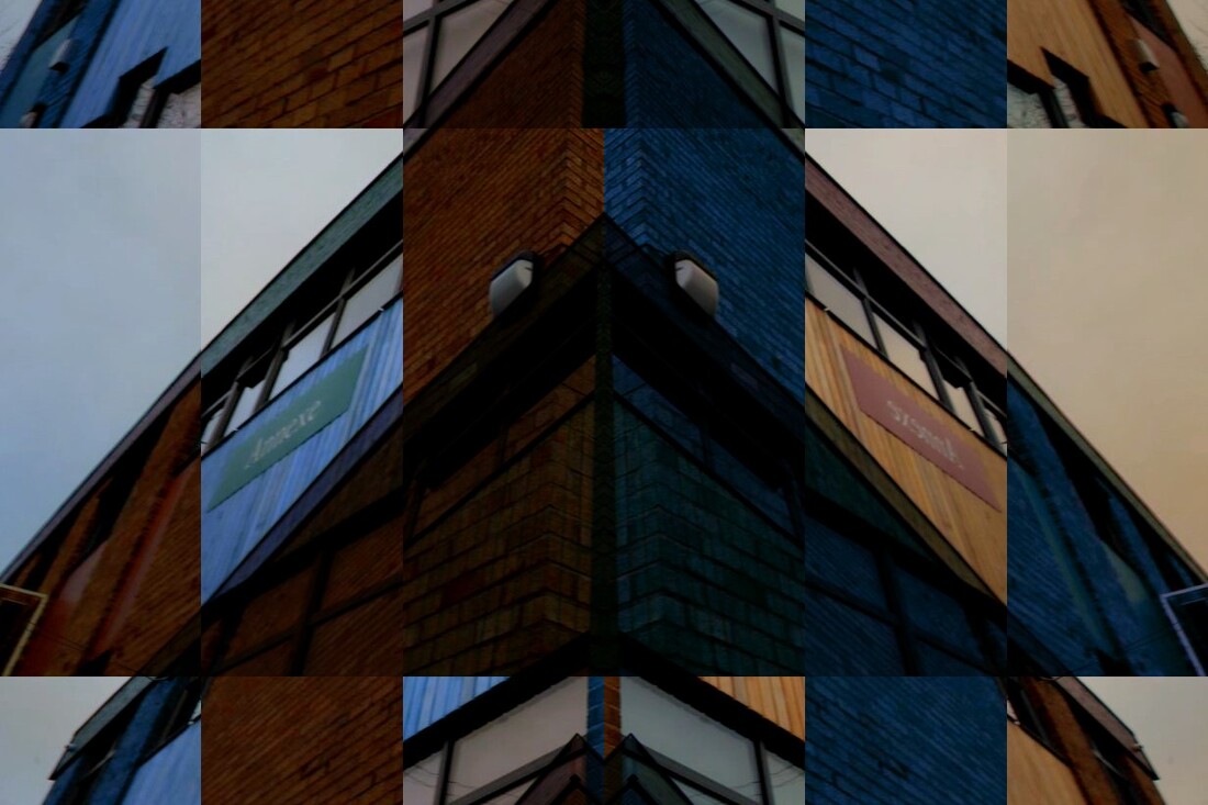
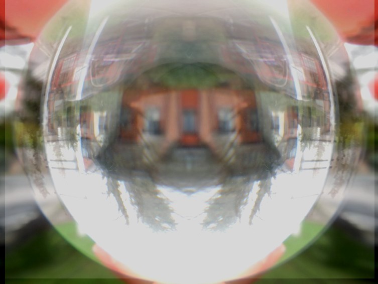
EVALUATION: The strengths of this image is the contrast between the left and right side. This is due to the left having a tint of blue and the right having a tint of yellow. These colours juxtapose one another as blue represents sadness and yellow represents happiness. I also like the use of splitting the image into sections and changing the placement of the building, this gives an abstract approach. However, the weaknesses are that the image is under exposed and very dark. Resulting in a loss of detail.
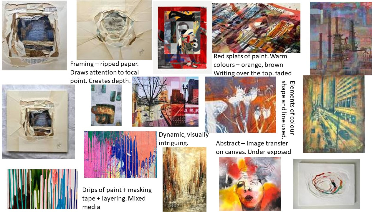
Composition Designs Initial Inspiration:

|
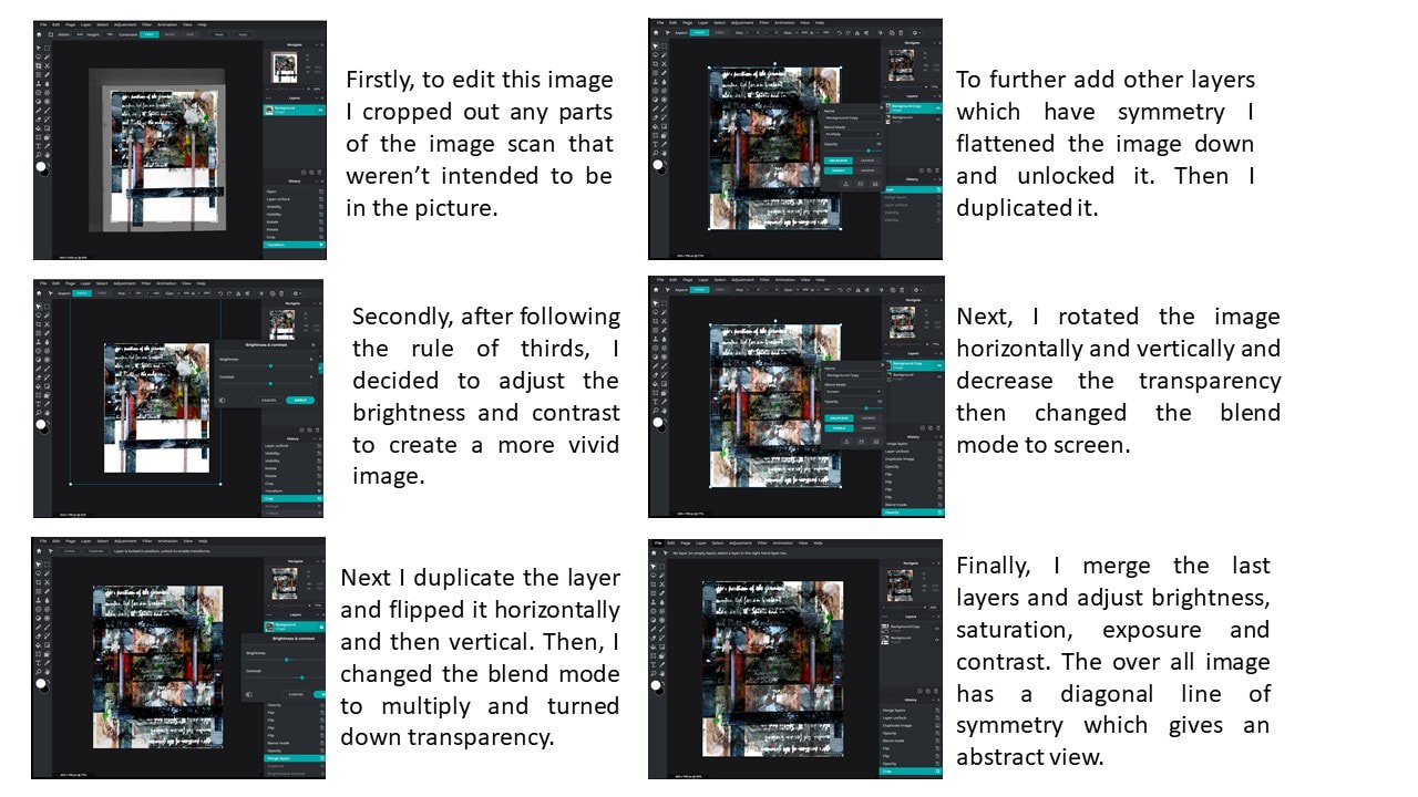
My initial thoughts for this project is to do an image transfer of previous shoots onto a canvas and create an abstract collage. Then I plan on to add elements like paint dripping, masking tape and spray paint. I plan on doing the majority of my editing physically on a canvas. However, before hand, I will edit some digitally to enhance the primary image. I will do this by increasing elements like contrast, saturation and exposure. This will help contribute to the final image looking the best it can and professional. For my second composition, I would like to do another image transfer onto a canvas and used shredded / ripped up pieces of paper to create a frame around my chosen photograph. This is in the style of Tomas Cambas and Caterina Giglio who both incorporate the method of framing in their work.
|
|

|
Composition Design 1
|
Composition 1 Shoot Aim
What is the aim of this shoot? In this shoot I intend on giving a joyful and alive atmosphere. I will do this by demonstrating the freedom and opportunities offered in a city by taking bright colourful images from past shoots and further editing them after physically. I will edit by doing an image transfer and putting mixed media on top. By doing this, I am contributing to this key idea of freedom and expression and opportunities. The bright colours I will use will also further add to this main theme. I will being taking inspiration from the artist Tom Quigley who is a mixed media artist. "the power or right to act, speak, or think as one wants." - oxford dictionary definition of freedom |

|


|
Composition 1 Techniques / Photographers
I am going to take inspiration from the work of Tom Quigley, who is a mixed media artist. Quigley takes original images and transfers them onto canvas' to further manipulate and add to them. I will be using the technique of painting over sublimation collages and images. I will also take inspiration from Tomas Cambas who incorporates bright vibrant colours throughout his work, I will do this by using an image I took while investigating Tomas Cambas and I will transfer it onto a canvas and add colour by painting. I will combine the work of both Tomas Cambas and Tom Quigley. "I am a mix media artist from Manchester focusing on urban landscape and the contrast between old and new" - Tom Quigley |
Composition 1 Physical Experiments Plan:
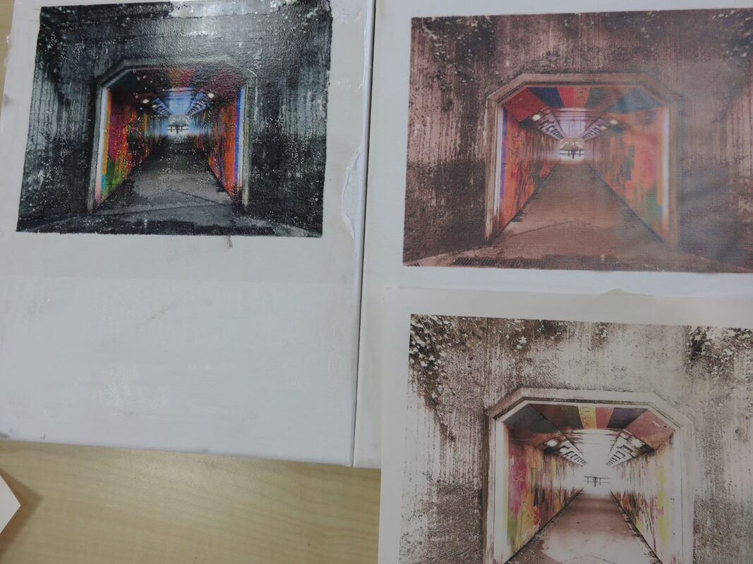
To create a final composition, I am firstly going to experiment different techniques on canvas' to be able to determine what looks successful and professional and what doesn't. I will be using an image from a previous shoot (the Tomas Cambas shoot) which has already been digitally edited. I will transfer this image onto a canvas and experiment with painting over it and adding masking tape and different medias to create texture. This experiment will take place in school and I plan for my best image to be displayed on a canvas.
To create a final composition, I am firstly going to experiment different techniques on canvas' to be able to determine what looks successful and professional and what doesn't. I will be using an image from a previous shoot (the Tomas Cambas shoot) which has already been digitally edited. I will transfer this image onto a canvas and experiment with painting over it and adding masking tape and different medias to create texture. This experiment will take place in school and I plan for my best image to be displayed on a canvas.
Composition 1 : Original Images

|

|
In order to physically edit these images, I did an Image transfer by sublimation (right) and PVA image transfer (left). These images are the originals before editing and adding in lots of mixed media.
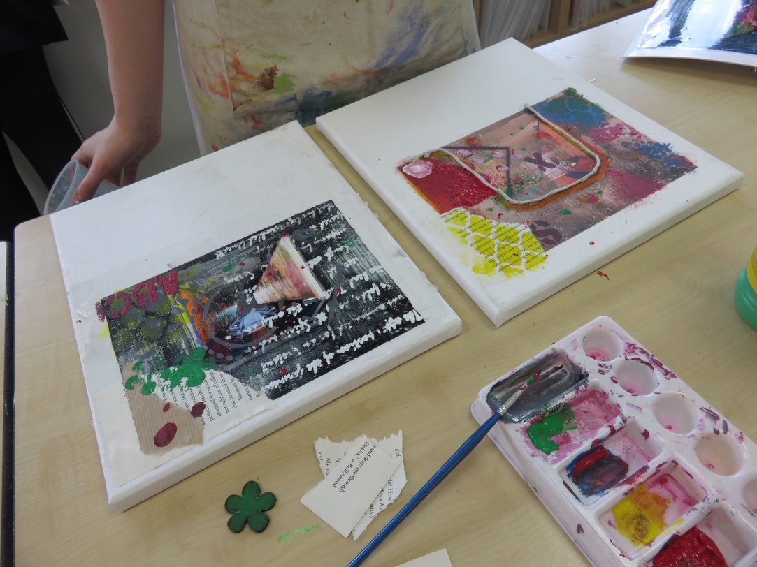
Composition 1 Best Images:

|

|
Composition 1 Development of Ideas:
To develop these physical edits I used acrylic paints and stencils to create texts and patterns, I added ripped paper and glued down cut out sections from the original image. I also rolled a small amount of black paint over it to tone down the bright vibrant colours.
To develop these physical edits I used acrylic paints and stencils to create texts and patterns, I added ripped paper and glued down cut out sections from the original image. I also rolled a small amount of black paint over it to tone down the bright vibrant colours.
Physically / digitally editing evidence:
|
|
Composition 1 Final Outcome:

|
|
Final Outcome Evaluation:
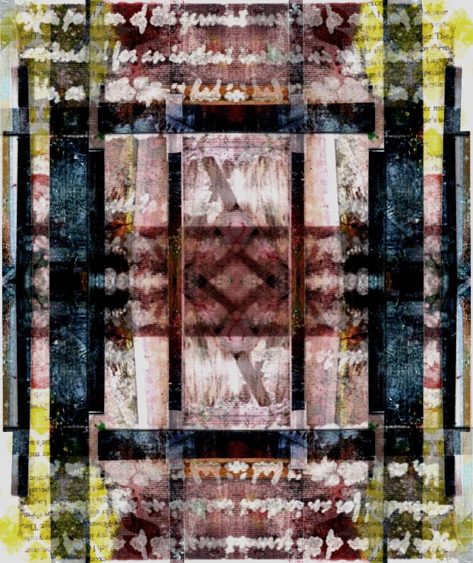
In my opinion, Composition 1 went really well because I successfully used a mix of different medias such as acrylic pain, stencils and ripped up paper. I feel that I have also successfully created the intent behind my image and I have also emulated the work of Tom Quigley. My favourite element in these images is the leading lines overlapping each other which direct your eyes around the photos. I think the usage of rotating, merging and blending was also very effective as it created lines of symmetry throughout the image. To further improve and develop, I could possibly stick closer to one colour theme more closely. However I do love the randomness in colours in these images as I think it gives it personality and creates a unique atmosphere. From this process have learned how to creatively experiment with different elements, not just digitally but physically too.
In my opinion, Composition 1 went really well because I successfully used a mix of different medias such as acrylic pain, stencils and ripped up paper. I feel that I have also successfully created the intent behind my image and I have also emulated the work of Tom Quigley. My favourite element in these images is the leading lines overlapping each other which direct your eyes around the photos. I think the usage of rotating, merging and blending was also very effective as it created lines of symmetry throughout the image. To further improve and develop, I could possibly stick closer to one colour theme more closely. However I do love the randomness in colours in these images as I think it gives it personality and creates a unique atmosphere. From this process have learned how to creatively experiment with different elements, not just digitally but physically too.
Composition Design 2:
|
Composition 2 Shoot Aim
What is the aim of this shoot? In this shoot I intend on using previous shoots used and physically editing them by adding ripped up paper and using them as a frame. This technique of framing using ripped paper represents focus of certain aspects (like the focal point of the image) and the unpredictability of life (the ripped edges of the paper used to frame). I will use lots of different layers on top of a digitally edited image. I will be taking inspiration from the artist Eileen Downes who uses the method of using lots of ripped paper. However I wont be creating an image with the paper, rather, I will be framing one I photographed. |

|
"In all things that live there are certain irregularities, and deficiencies which are not only signs of life, but sources of beauty. No human face is exactly the same in its lines on each side, no leaf perfect in its lobes, no branch in its symmetry" - John Ruskin


YouTube tutorials:

|

|
|
Composition 2 Techniques / Photographers:
I have taken inspiration from the artist Eileen Downes. I would like to use Eileen Downes method of ripping paper. Her technique is created images from shredded paper. However, I would like to emulate her work by creating a frame around an image I have already taken and edited. I will then further ad to this image by adding an overlay digitally. |
Composition 2 Physical Experiments Plan:
I plan to create my composition 2 by ripping up pieces of paper and carefully placing them around my printed image to create a rustic final piece. I will then seal my image and give it a look of good quality by putting a layer of PVA glue over the top. I personally think the method of ripped paper has a deeper meaning behind, as it gets rid of the idea of perfection. It does this as the loneliness are not exactly straight, Rather they are random and unpredictable. This represents life in this unpredictable world |
Physically / digitally editing evidence:
|

Final image scan:

|
Editing process:

Composition 2 Final Outcome:
Final Outcome Evaluation:
In my opinion, Composition 2 was extremely successful because I created exactly what I had planned on creating and I have also done well to take inspiration from Eileen Downes' work without completely following her style. I have twisted her style to frame an image which contributes nicely to the focal point in the photo. I feel that the overlay I added also further adds to the rustic, rough vibe I was going for as it adds age and therefore creates an aesthetically pleasing overall outcome. My favourite part of this image is the rough edges caused by the ripped paper. This lack of perfection challenges the idea of precision society so often pressures people to achieve. However, To further develop my final outcome, I could further digitally edit it by adding different overlays. From this process i have learned the importance of directing the viewers eyes to the focal point by adding frames.
In my opinion, Composition 2 was extremely successful because I created exactly what I had planned on creating and I have also done well to take inspiration from Eileen Downes' work without completely following her style. I have twisted her style to frame an image which contributes nicely to the focal point in the photo. I feel that the overlay I added also further adds to the rustic, rough vibe I was going for as it adds age and therefore creates an aesthetically pleasing overall outcome. My favourite part of this image is the rough edges caused by the ripped paper. This lack of perfection challenges the idea of precision society so often pressures people to achieve. However, To further develop my final outcome, I could further digitally edit it by adding different overlays. From this process i have learned the importance of directing the viewers eyes to the focal point by adding frames.
Urban Environment Evaluation:
Throughout this project I have developed my understanding of urban environment by researching different artists, analyzing their work, emulating their work and experimenting with mixed media. One main thing I have learnt about is the intent behind images taken by Urban Environment photographers, such as the peacefulness experienced in cities contrasting with the loneliness, tranquility vs chaos. I feel that this project has given me a greater understanding of peoples different perspectives.
Initially I researched the work of Pedro Correa. Through studying this artist, I was able to explore concepts of contrast, movement and texture. This study helped me understand how important it is to combine different techniques, like adding layers or working with reflections in my own work. Pedro Correa also takes his images at eye level which I have incorporated throughout this project. Their work helped me understand the theme of urban environments by demonstrating that urban environments didn't just have to be images of buildings, but other things like cars and people could be photographed too.
Secondly, I researched the work of Tomas Cambas. Through studying in depth the work of this artist, I was able to explore concepts such as line, shape and emphasis. Inspired by his work, I created a series of emulations by going to a town center and finding areas that had key elements that Cambas uses such as line. I did this by finding buildings that had framing in them like windows, staircases and tunnels. I later used one of my images for both compositions as it included lots of elements in it such as colour. This concluded to making three final pieces. I investigated the technical process of digitally editing my images to make the focal point saturated and desaturate the surrounding areas. I also investigated physically editing with mixed media and ripped up paper. Their work helped me to understand the theme of Urban environments by focusing on specific points instead of vast areas, creating a detailed focal point instead of lots of areas of focus generates interest for viewers.
Thirdly, I researched the work of Mihai Florea. This artist helped me understand the key concepts of unity, colour and balance. I used their example in my own work, experimenting in desaturated images, and taking images from different angles. I also tried to search for symmetry and rhythm in following shoots. Their work helped me to understand the theme of urban environments as they really focused on the beauty and complexity behind buildings in cities. I really liked Florea's method of taking monochromatic images.
Finally, I researched the work of Riccardo Magherini. This particular artist focuses on key elements colour, movement and rhythm which I them incorporated in my own work. Inspired by their work, I created a series of emulations by taking pictures of urban environments and digitally editing them To digitally edit, I followed the example of Magherini and duplicated an image multiple times, reduced the transparency and adjusted the placement. In my opinion this method was very effective and gave a sense of movement in the image. Their work helped me understand the theme of urban environment by demonstrating the sense of thriving life, shown by the movement portrayed in the final outcomes.
I feel that the most successful part of this urban environment project was my composition 1 as I used a large variety of techniques. Those being - using mixed media, digitally editing, adding ripped paper. From this composition I took inspiration from Tomas Cambas with primary image, then, for my physically editing I took inspiration from Tom Quigley and finally from my final image which I edited on PIXLR, I used the method of rotating and blending images. Overall this was my most successful outcome, as it took me the longest to complete and had multiple complicated steps. I thoroughly researched the work before hand and planned out each step which I believe added to a high standard.
Going forward, I believe i could improve my work more by studying further artists who experiment with physical editing rather than just digitally. I believe this amount of research could then be reflected into my own emulations of their work and therefore broaden my knowledge.
